What airline passengers should know about their rights to get refunds
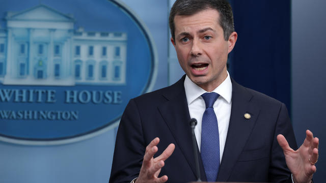
New Transportation Department rules could save consumers $500 million annually, Transportation Secretary Pete Buttigieg said.
Watch CBS News
New Transportation Department rules could save consumers $500 million annually, Transportation Secretary Pete Buttigieg said.

Lawmakers argue the Chinese government can use the widely popular video-sharing app as a spy tool and to covertly influence the U.S. public.

Proponents say a sweeping ban on noncompete clauses should boost workers, but the new rules face serious legal challenges.
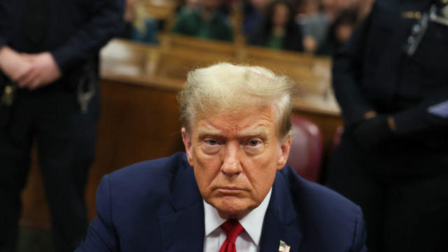
Trump Media CEO Devin Nunes is asking four House committees to investigate possible "naked" short selling in the company's shares.

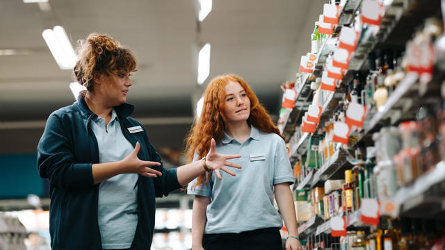
Travelers often spend more than they need to for airfare, experts say. Here's what to know about paying for add-ons like your seat assignment.

TikTok ban measure signed by Biden. Here's what could happen next.
Expanded federal overtime rule could result in employers paying workers an additional $1.5 billion, according to one estimate.

Regulators prohibit new noncompetes, which impede millions of U.S. workers from getting a better job.
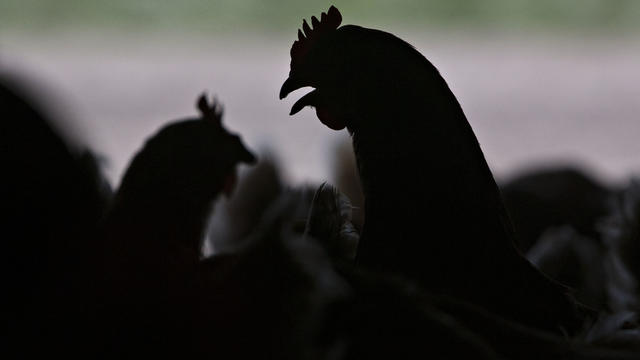
Egg prices are jumping as an outbreak of highly pathogenic avian influenza forces producers to slaughter millions of infected birds.

If you're thinking about getting a home equity loan, you may want to do so before May. Here's why.

A debt relief service may be able to help you deal with mounting debt. Here's why now is a great time to sign up.

There are a few reasons why you may want to put some money in gold before the Fed meets again. Here's what to know.
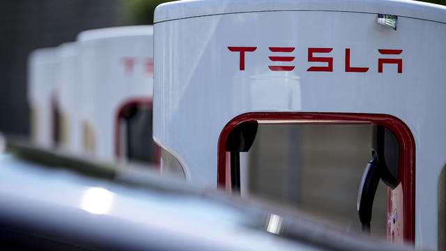
Tesla accounted for 80% of electric vehicle sales in the U.S. in 2020, but that figure fell to 55% last year.
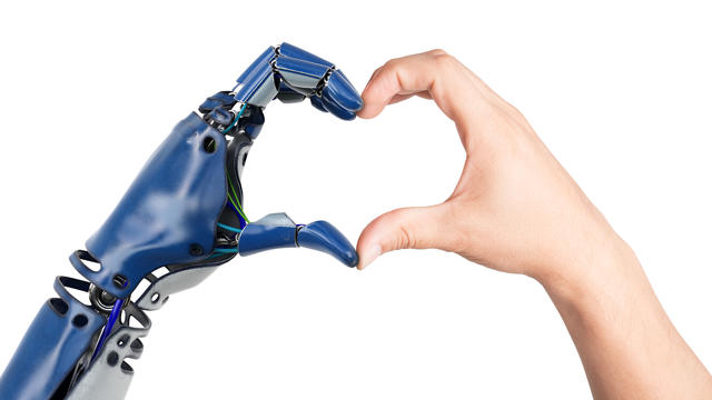
The generative artificial intelligence boom has led to the emergence of romantic companion bots.

Apple said it will stop selling the devices later this month in order to comply with a U.S. import ban.

Alex Jones, the conspiracy theorist known for his fake news site InfoWars and his false denial of the Sandy Hook massacre, was permanently banned from Twitter in 2018.
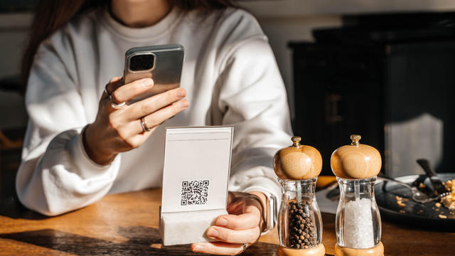
More than 90 million consumers will scan a QR code this year. But the technology can also facilitate identity theft.
The billionaire owner of X took a defensive tone, saying that "the whole world will know that those advertisers killed the company."
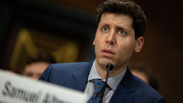
OpenAI co-founder Sam Altman says he's looking forward to returning to the company, with the support of Microsoft's CEO, to build the 2 companies' "strong partnership."

Musk, who is under fire for supporting an antisemitic post, said the money will be donated to hospitals in Israel and to the Red Cross in Gaza.
Altman landed at Microsoft, the biggest investor in OpenAI, as former Twitch leader Emmett Shear was named OpenAI's new chief executive.
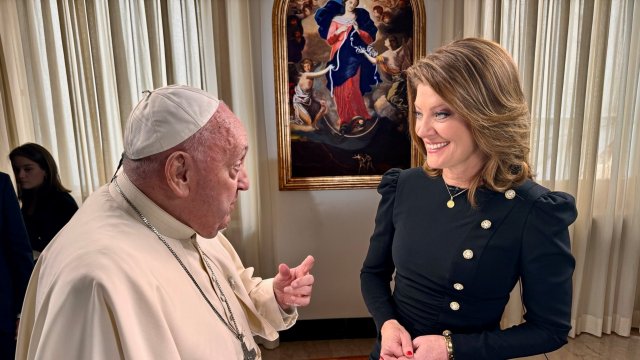
In an exclusive interview with CBS News' Norah O'Donnell, Pope Francis called for "negotiated peace" in Ukraine and Gaza, noting the devastating effects war has on children.

An Arizona grand jury indicted 18 people in connection with an alleged attempt to use alternate electors after the 2020 election.
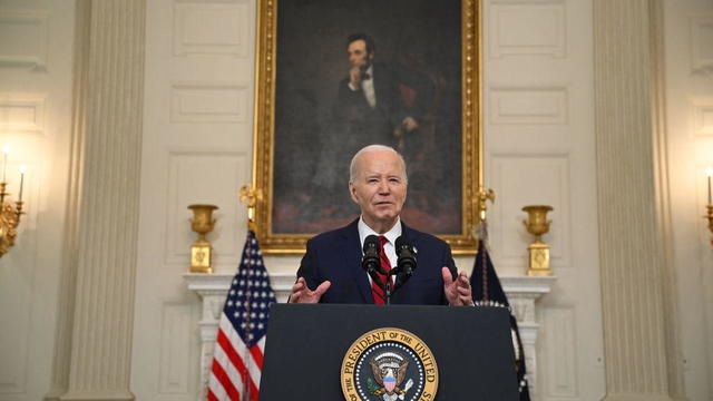
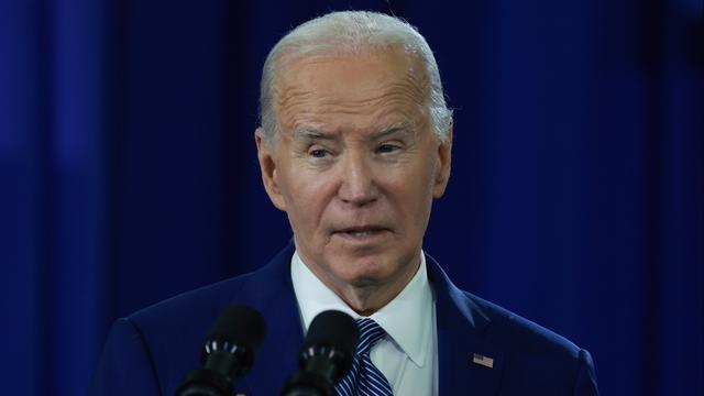
"It's a good day for America, it's a good day for Europe and it's a good day for world peace," Mr. Biden said in remarks from the White House.
Earlier this month, the Arizona Supreme Court ruled that the highly-restrictive 160-year-old law that bans nearly all abortions can be enforced.
Two sources briefed on the situation told CBS News the agent spouted gibberish, was speaking incoherently and provoked another officer physically.
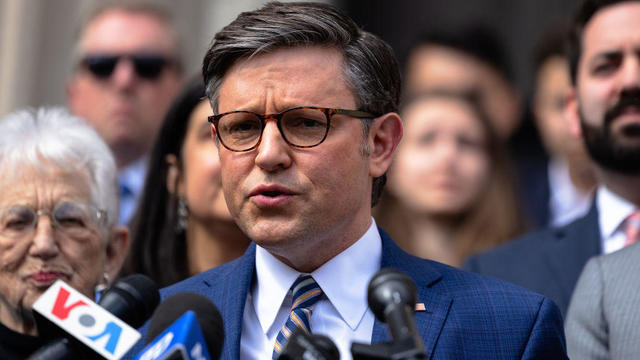
House Speaker Mike Johnson was met with loud boos as he visited Columbia University, where he joined calls for the president's resignation amid pro-Palestinian protests.
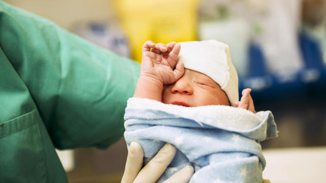
CDC's provisional figures show a 2% decline in births from 2022 to 2023.
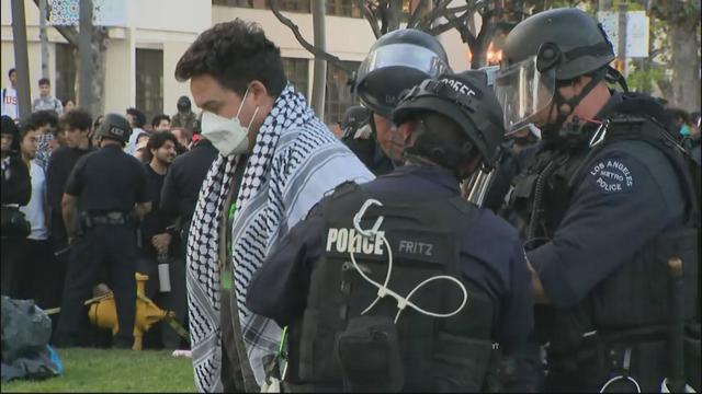
Campus Department of Public Safety officers visited the encampment, instructed students not to hang signs, flags or other materials from trees and posts in the park, and warned them not to use megaphones.
Classes at James Bowie High School were canceled for Thursday.

The U.S. is reaching "peak 65," marking the largest retirement wave in American history. But the financial outlook for many is grim.

Americans are underprepared for retirement, with the average account holding just $88,400 in savings.
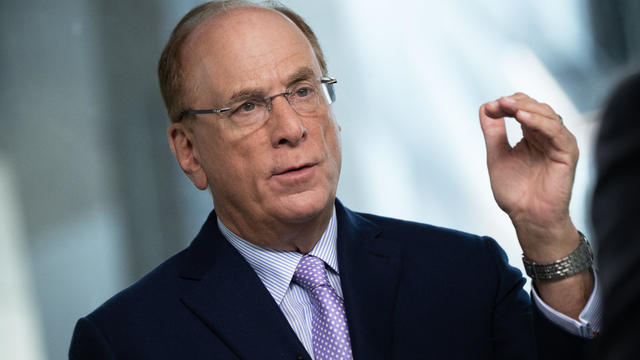
BlackRock CEO Larry Fink said that longer life expectancies are "putting the U.S. retirement system under immense strain."

About 1 in 8 workers think they'll retire by age 61. But the reality of saving for decades of expenses is daunting.

America's retirement system has left behind 90% of workers. "We see big gaps with the rich and the poor in terms of who gets to retire," one expert said.
CDC's provisional figures show a 2% decline in births from 2022 to 2023.
An Arizona grand jury indicted 18 people in connection with an alleged attempt to use alternate electors after the 2020 election.
Two sources briefed on the situation told CBS News the agent spouted gibberish, was speaking incoherently and provoked another officer physically.
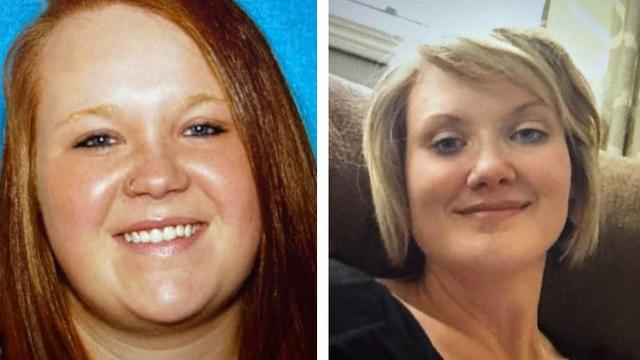
Paul Grice, 31, was arrested and charged by Oklahoma authorities with murder and kidnapping in connection to the deaths of Veronica Butler and Jilian Kelley.

Two-year-old Tyler Fabregas asked his mother "Where's Beyoncé?" in a viral TikTok video she posted last week from Manila.
Proponents say a sweeping ban on noncompete clauses should boost workers, but the new rules face serious legal challenges.
Egg prices are jumping as an outbreak of highly pathogenic avian influenza forces producers to slaughter millions of infected birds.
New Transportation Department rules could save consumers $500 million annually, Transportation Secretary Pete Buttigieg said.
Niselio Barros Garcia Jr., 50, scammed victims out of $2.3 million in funds, according to authorities.
Trump Media CEO Devin Nunes is asking four House committees to investigate possible "naked" short selling in the company's shares.
An Arizona grand jury indicted 18 people in connection with an alleged attempt to use alternate electors after the 2020 election.
Two sources briefed on the situation told CBS News the agent spouted gibberish, was speaking incoherently and provoked another officer physically.

Four-year-old Abigail Mor Edan was held by Hamas for 50 days and was the youngest American hostage released by Hamas.
House Speaker Mike Johnson was met with loud boos as he visited Columbia University, where he joined calls for the president's resignation amid pro-Palestinian protests.
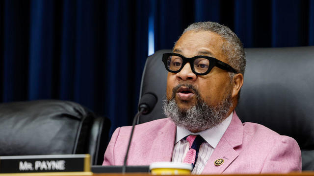
The New Jersey Democrat suffered "a cardiac episode based on complications from his diabetes" earlier this month, his office said.
CDC's provisional figures show a 2% decline in births from 2022 to 2023.

Don't brush your teeth after breakfast? Or after vomiting? Dentists say it can wear away your enamel. Here's what to do instead.
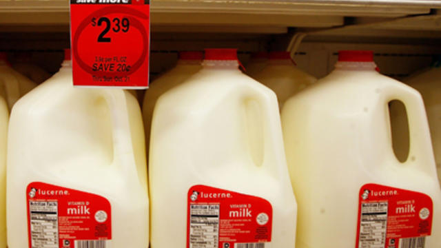
Federal officials say they're double checking whether pasteurization has eradicated the danger from possible bird virus particles in milk.

For the first time, surgeons at NYU Langone Health performed a combined mechanical heart pump and gene-edited pig kidney transplant into a living person.

The USDA had floated banning flavored milk options from some school lunches.
In an exclusive interview with CBS News' Norah O'Donnell, Pope Francis called for "negotiated peace" in Ukraine and Gaza, noting the devastating effects war has on children.
Two-year-old Tyler Fabregas asked his mother "Where's Beyoncé?" in a viral TikTok video she posted last week from Manila.
Four-year-old Abigail Mor Edan was held by Hamas for 50 days and was the youngest American hostage released by Hamas.

Gustav Klimt's "Portrait of Fräulein Lieser," which went missing after its owners fled Austria after 1930, was auctioned off for $32 million.

A video released by Hamas' military wing appears to show U.S.-Israeli hostage Hersh Goldberg-Polin delivering a message under duress.
Two-year-old Tyler Fabregas asked his mother "Where's Beyoncé?" in a viral TikTok video she posted last week from Manila.
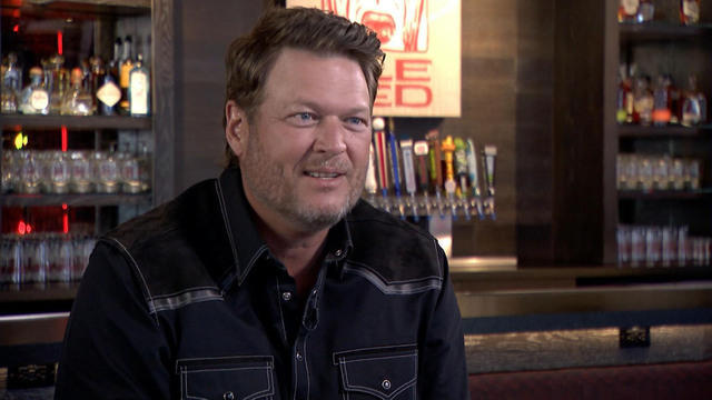
Country music star Blake Shelton expands his popular bar and music venue 'Ole Red' from Nashville to Las Vegas. This opening coincides with Shelton stepping back from his prominent TV roles.

Surprise guests, a broken foot and a history-making headliner.
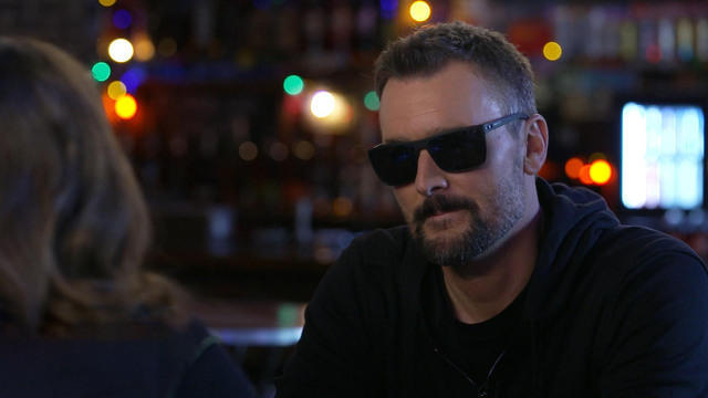
Eric Church is revered as one of country music's most respected figures, often described as Nashville's renegade. But he admits that even after his success, he sometimes still sees himself as an outsider.

Angel Carter Conrad talks about her brother Aaron Carter, his death and how she hopes his legacy and previously unheard music can help others.
Lawmakers argue the Chinese government can use the widely popular video-sharing app as a spy tool and to covertly influence the U.S. public.
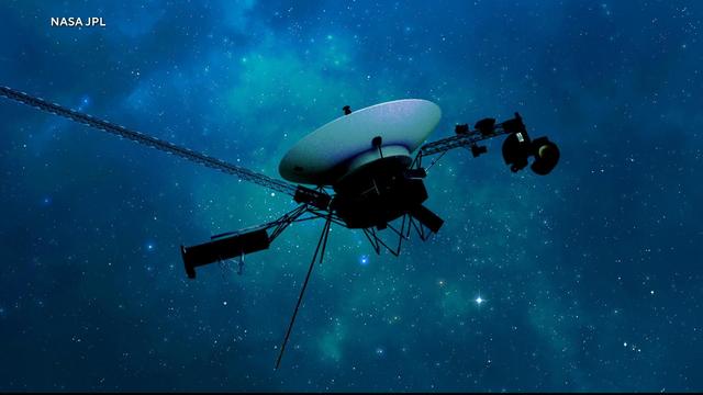
NASA's Voyager 1, the first spacecraft to travel beyond our solar system, has started sending information back to Earth again after scientists managed to fix the probe from 15 billion miles away.

From labor shortages to environmental impacts, farmers are looking to AI to help revolutionize the agriculture industry. One California startup, Farm-ng, is tapping into the power of AI and robotics to perform a wide range of tasks, including seeding, weeding and harvesting.

Customers who rely on government assistance programs can get same perks as Prime members, for less.
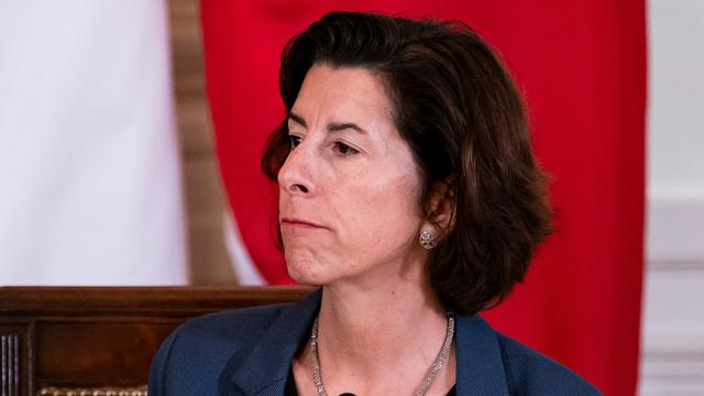
Secretary of Commerce Gina Raimondo is at the center of a global competition for semiconductor dominance. It's a battle that also puts her at the center of two of the hottest global national security hotspots. Lesley Stahl of 60 Minutes spoke with Raimondo for the broadcast.

Emerging cicadas are so loud in one South Carolina county that residents are calling the sheriff's office asking why they can hear a "noise in the air that sounds like a siren, or a whine, or a roar." CBS News' John Dickerson has details.
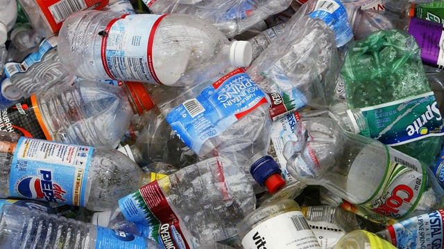
Representatives from across the world are gathering in Ottawa, Canada, to negotiate a potential treaty to limit plastic pollution. CBS News national environmental correspondent David Schechter has the latest on the talks.

"Although to some, the noise is annoying, they pose no danger to humans or pets," the sheriff wrote. "Unfortunately, it is the sounds of nature."
The White House is considering declaring a national climate emergency to unlock federal powers and stifle oil development, according to a Bloomberg report. Meanwhile, the Biden administration is announcing several projects this Earth Week. Columbia University Climate School professor Dr. Melissa Lott joins with analysis.
NASA's Voyager 1, the first spacecraft to travel beyond our solar system, has started sending information back to Earth again after scientists managed to fix the probe from 15 billion miles away.

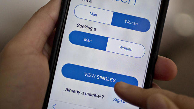
All this week, CBS News has been investigating online romance scams. In this final installment, Jim Axelrod looks at what law enforcement and lawmakers can do -- but also why it's important for the online dating industry to police itself.
Paul Grice, 31, was arrested and charged by Oklahoma authorities with murder and kidnapping in connection to the deaths of Veronica Butler and Jilian Kelley.
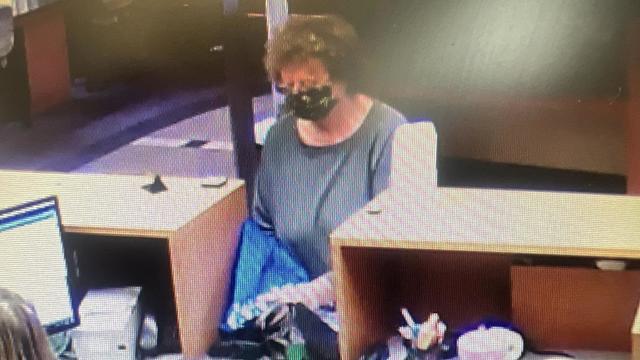
Ann Mayers entered AurGroup Credit Union on April 19 and "demanded money while displaying a handgun," police said.
Niselio Barros Garcia Jr., 50, scammed victims out of $2.3 million in funds, according to authorities.
Glenn Sullivan Sr., 54, pleaded guilty to four counts of second-degree rape on April 17.
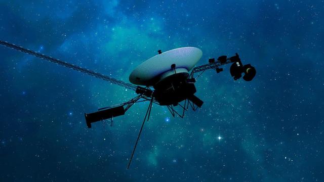
In November 2023, NASA's Voyager 1 spacecraft stopped sending "readable science and engineering data."
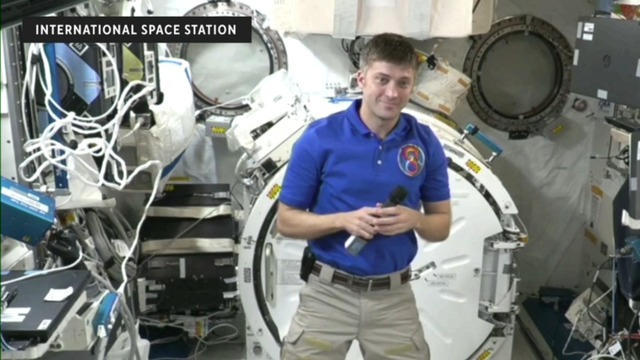
In two weeks, Boeing's Starliner spacecraft is scheduled to launch its first piloted test flight, bringing two veteran NASA astronauts to the International Space Station. Astronaut Matt Dominick joined CBS News from the ISS to talk about the mission and life in space.

A process called cryopreservation allows cells to remain frozen but alive for hundreds of years. For some animal cells, the moon is the closest place that's cold enough.
The Lyrid meteor show is set to peak as the week begins.

April's full moon, known as the Pink Moon, will reach peak illumination on Tuesday, but it will appear full from Monday morning through Thursday morning.

A look back at the esteemed personalities who've left us this year, who'd touched us with their innovation, creativity and humanity.

The Francis Scott Key Bridge in Baltimore collapsed early Tuesday, March 26 after a column was struck by a container ship that reportedly lost power, sending vehicles and people into the Patapsco River.
When Tiffiney Crawford was found dead inside her van, authorities believed she might have taken her own life. But could she shoot herself twice in the head with her non-dominant hand?

We look back at the life and career of the longtime host of "Sunday Morning," and "one of the most enduring and most endearing" people in broadcasting.

Cayley Mandadi's mother and stepfather go to extreme lengths to prove her death was no accident.
Emerging cicadas are so loud in one South Carolina county that residents are calling the sheriff's office asking why they can hear a "noise in the air that sounds like a siren, or a whine, or a roar." CBS News' John Dickerson has details.
All this week, CBS News has been investigating online romance scams. In this final installment, Jim Axelrod looks at what law enforcement and lawmakers can do -- but also why it's important for the online dating industry to police itself.
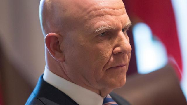
When President Biden signed a foreign aid bill Wednesday that includes tens of billions of dollars in assistance to Ukraine, Israel and Taiwan, it was touted as money that would "strengthen our national security and send a message to the world about the power of American leadership." Retired Lt. Gen. H.R. McMaster, former national security adviser, joins CBS News with analysis.
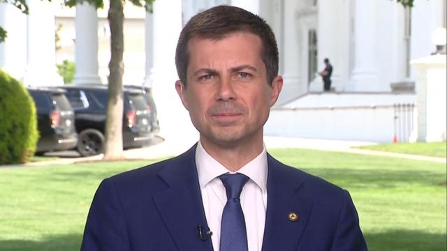
The Transportation Department announced new rules Wednesday requiring airlines to issue automatic cash refunds for flight cancelations or delays, delayed baggage returns and services like Wi-Fi or seat selection that are paid for but not provided. Transportation Secretary Pete Buttigieg joins CBS News to discuss the changes and how airlines are reacting.

American schools are facing layoffs as enrollment falls and pandemic-era aid dries up. CBS News reporter Bo Erickson has the details.